
Aligning Text in LibreOffice Writer
Ducks in a Row

© synell, 123RF.com
To get professional publishing results, here are a few tips and tricks to get the most out of LibreOffice Writer’s alignment options.
Just because an option in LibreOffice Writer is easy to choose does not mean that it is easy to use. Take, for example, alignment, or how characters are arranged between the left and the right margin on a line. A single click on the Alignment tab of a paragraph style will set the alignment to right, center, left (ragged right), or justified (i.e., evenly distributed between the margins). Yet to use any alignment takes design knowledge and, sometimes, extra effort as well (Figure 1).
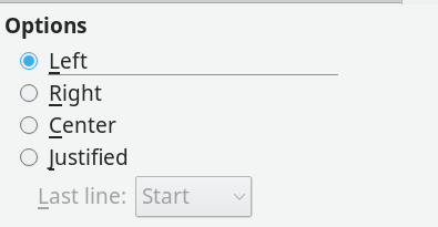 Figure 1: LibreOffice Writer offers four alignment choices.
Right Alignment
Aligning letters to the right margin is used the least. Right alignment is used only in layout, such as a title page. A basic rule of layout is that related information, such as the lines of a mailing address should have a common alignment. For instance, an address on a letter is traditionally right aligned. You often find a right alignment on a brochure or diagram as well. Generally, though, only a few lines in a document are likely to have a right alignment, for the simple reason that most European languages read from left to right, and an uneven left margin is harder to read and just looks wrong to most people.
Center Alignment
In the long gone, unlamented days of typewriters, titles were often center aligned, for the simple reason that the options for differentiating the title from the main text were few. Today, however, a title can easily be a different size or font, and a center alignment, like a right one, is only seen in more elaborate layouts.
Left vs. Justified Alignment
Left and justified alignments are the most common choices in layout. However, which one to use depends on the context.
For decades, left alignment was the default on typewriters. Only late model typewriters with a few kilobytes of memory ever managed justified lines. For the most part, industrial typesetting machines alone offered justification -- and even they often required manual tweaks to look their best. Consequently, in many people’s minds, justification is still the main indicator of professional design. Armed with this expectation, today many can be loudly scornful of left alignment.
However, for professional typographers, the choice is more complicated. To start with, the algorithms for justifying lines of text can be very poor, and heavy editing and revision can leave justified lines a mess with unsightly variations in the spaces between characters and words. You can see a small sample of the difficulties by investigating Writer’s options for the last line of a justified paragraph: Start (left-aligned), Center, and Justified. To be fair, some tools, including Writer, have improved greatly over the years, but, in others, users are better off avoiding justification altogether.
Yet even in Writer, justification is not always the best choice. Faced with short sentences, such as an instruction manual with numbered steps or a table with narrow columns, justification can struggle to produce a decent-looking page (Figure 2). Sometimes, a change of fonts, font size, or character spacing on the Position tab helps, but too often such modifications can compromise the overall look of the design by introducing too many changes in the default appearance. Sometimes, a left alignment may also be unsuitable (Figure 3), yet, by contrast, a left alignment tends to look better than justification, even before tweaking. Just as importantly, if a document will be frequently revised, then a left alignment can mean less maintenance. Besides, some designers will deliberately use a left alignment simply out of nostalgia for typewriters. Fortunately, the great advantage of word processors is that changes are easily made, so you can experiment until you find the best alignment for your purposes and aesthetics.
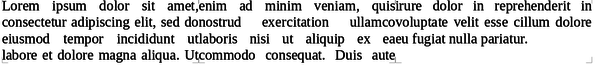 Figure 2: In this three column layout, justification has such an irregular spacing, it is hard to see where a new column begins.
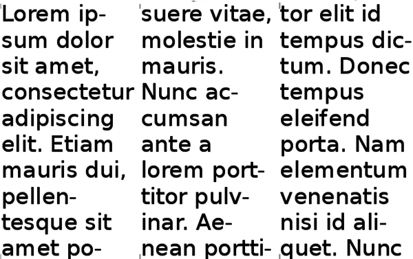 Figure 3: Here, a left alignment produces too many hyphens and lines with only a single word. The font is probably too large.
Buy Linux Magazine
US / Canada
UK / Australia
Subscribe to our Linux Newsletters
Find Linux and Open Source Jobs
Subscribe to our ADMIN Newsletters
Support Our Work
Linux Magazine content is made possible with support from readers like you. Please consider contributing when you’ve found an article to be beneficial.

News
-
So Long Neofetch and Thanks for the Info
Today is a day that every Linux user who enjoys bragging about their system(s) will mourn, as Neofetch has come to an end.
-
Ubuntu 24.04 Comes with a “Flaw"
If you're thinking you might want to upgrade from your current Ubuntu release to the latest, there's something you might want to consider before doing so.
-
Canonical Releases Ubuntu 24.04
After a brief pause because of the XZ vulnerability, Ubuntu 24.04 is now available for install.
-
Linux Servers Targeted by Akira Ransomware
A group of bad actors who have already extorted $42 million have their sights set on the Linux platform.
-
TUXEDO Computers Unveils Linux Laptop Featuring AMD Ryzen CPU
This latest release is the first laptop to include the new CPU from Ryzen and Linux preinstalled.
-
XZ Gets the All-Clear
The back door xz vulnerability has been officially reverted for Fedora 40 and versions 38 and 39 were never affected.
-
Canonical Collaborates with Qualcomm on New Venture
This new joint effort is geared toward bringing Ubuntu and Ubuntu Core to Qualcomm-powered devices.
-
Kodi 21.0 Open-Source Entertainment Hub Released
After a year of development, the award-winning Kodi cross-platform, media center software is now available with many new additions and improvements.
-
Linux Usage Increases in Two Key Areas
If market share is your thing, you'll be happy to know that Linux is on the rise in two areas that, if they keep climbing, could have serious meaning for Linux's future.
-
Vulnerability Discovered in xz Libraries
An urgent alert for Fedora 40 has been posted and users should pay attention.